
- Write the book’s definition of design and tell structural design from applied design
- Explain the elements of design: colour (Munsell’s colour wheel, value, chroma, the grey scale, the Pantone shade card, colour schemes), texture, line, shape and pattern
- Show how adding colour at the fibre, yarn or fabric stage changes the design of a fabric
- Explain the principles of design (proportion, balance, emphasis, rhythm, harmony) and composition with dress examples
- Describe how to prepare for a career in this field, its scope, and the tie and dye, batik and block printing practicals
1 Unit IV introduction: Fabric and Apparel
This chapter opens Unit IV (Fabric and Apparel) of Part 2 of the book. The points of the unit introduction worth knowing:
- Textile materials are among the oldest materials known to the human world
- Fabrics of cotton, wool, linen and silk have been used since pre-historic times for apparel and household articles, and also for fishing and hunting nets, ropes and sails for ships
- The last century added manufactured and synthetic fibres to the natural ones
- Textiles are also a medium for human creativity, giving items of arts and artifacts valued for their aesthetic appeal and versatility
- Design is not mere decoration; it is the planning and creation of an article for a specific purpose. Special treatments that make fabrics suitable for a specific use are a good example of Textile Designing
- Over time we develop a special style. Designers who give us that consistent look and also adapt current trends are called Fashion Designers
1.1 Three facets recalled from Class XI
Textile materials
Knowledge of basic textile materials and their properties, for the right selection and for their care and maintenance.
Significance of clothing
Social, psychological and economic aspects; geographical, cultural and religious needs; age and physical growth; purely aesthetic or decorative aspects.
Indian textiles
The rich heritage of Indian textiles and its importance to India’s economy.
1.2 The five areas discussed in Unit IV
| Area | Key point |
|---|---|
| Design in Fabric and Apparel | Understanding the fundamentals of design (this chapter) |
| Fashion Design and Merchandising | The design industry is a vibrant, varied and dynamic creative sector; students learn how the fashion business operates |
| Production and Quality Control in the Garment Industry | An important part of the Indian economy; an increasing avenue of jobs |
| Conservation of textile products | Particularly in museums, resource centres for revival, preservation, reproduction and awareness |
| Care and Maintenance of Fabrics in Institutions | Entrepreneurship, from household services and commercial laundries to hospitals and the hospitality sector |
- The subject goes by many names: Textiles and Clothing, Clothing and Textiles, Textiles and Fashion Study, Fashion and Textile Science, Textile Science and Apparel Design
- It is taught as after-school courses, as degrees or diplomas in Home Science colleges, in polytechnics teaching textile and fashion design, and in Art and Design institutes
- Home Science colleges offering P.G. degrees try to give comprehensive knowledge of all aspects
2 What is design?
- ‘Design’ is a popular contemporary term with many meanings
- It is often used for high fashion dress and its accessories; in fabrics, for the colour scheme or the print. That is not the complete picture
- Design is not mere decoration
- The most aesthetically pleasing object cannot be called well designed if it is not functional or not appropriate to its use
- In the broadest sense, design can be described as harmony in form
- The greatest harmony is achieved only when the aesthetic side of a good design is truly integrated with the utility of the object
“Design is the human power to conceive, plan, and realise products that serve human beings in the accomplishment of any individual or collective purpose.”
- A good design is more than aesthetically pleasing
- It is the right use of materials to give what people expect in price, colour and service
Beautiful + useful = good design. Looking beautiful alone is not enough.
The key idea of this chapter
3 Basic concepts: design analysis
- Design is an arrangement according to a plan for the creation of a desired object
- It goes one step further than the functional part of planning
- Its result gives aesthetic satisfaction (the pleasure of something that looks right)
- Design is studied in two aspects: structural and applied
Structural design is that which depends on form and not on superimposed ornamentation.
Applied design is the part of the design which has been superimposed on the basic structure.
Structural design
- Depends on form, not on added ornament
- In fabric production: basic processing of fibre, types of fibres and yarns, variations of weaving and knitting, and the stages at which colour is added
- In dress: the basic cut or silhouette (outline shape) of the garment
Applied design
- Superimposed on the basic structure
- On fabric: finishes, dyeing and printing, embroidery and fancy needle-work, which change the appearance
- On garments: trims and notions (fasteners), which add to the value of the final product
Fabric design and dress design are as much an Art as architecture, painting or sculpture, so the same Grammar of Art applies to them.
When asked to distinguish structural and applied design, give one fabric example and one dress example for each, as in the table above.
4 The two main factors: elements and principles
- Elements of design are the tools of the Art: colour, texture, and line, shape or form
- The elements are manipulated to create harmony, balance, rhythm, proportion and emphasis
- These five are the principles of design
- The book’s sentence lists colour, texture, line and shape or form; pattern, made by grouping shapes, is studied with them (the syllabus lists it as the fifth element)
Elements = the things · Principles = the rules
Elements are what a design is made of; principles are the rules for arranging them.
5 Element 1: colour
- Colour is all around us and is one of the most important aspects of every textile material, for apparel, household, commercial or institutional use
- The identity of a product is most often attributed to its colour
- Everyone responds to colour and has definite preferences
- Colour reflects the season, events and the spirit of people
- The choice is affected by culture, tradition, climate, season, occasion or purely personal reasons
- Colour is an important part of fashion; designers choose fabric colours carefully to make a definite statement
5.1 Understanding colour: the spectrum
- The study of colour depends on light
- Light is a form of radiant energy and part of the electro-magnetic radiation spectrum
- Sunlight is the radiant energy reaching the Earth from the Sun by light waves
- Light falling on raindrops is scattered into a spectrum of seven colours, VIBGYOR: Violet, Indigo, Blue, Green, Yellow, Orange and Red
- Sunlight is made of these seven visible colours along with ultra-violet and infra-red rays
5.2 Colour theory: how we see colour
Colour can be defined as the reflection of light striking the surface of an object.
- The colour the brain sees depends on the wavelength, or combination of wavelengths, of the light source
- To see colour on any material, light must be reflected from the object to the eye
- When all light rays are reflected, the object looks white
- When none are reflected, it looks black
Short wavelengths
- green, blue green, blue and purple
- receding or restful colours
Longer wavelengths
- red, orange and yellow
- advancing or stimulating colours
Because light is made of different wavelengths, colour is seen in different values and intensities.
5.3 The three aspects of colour: hue, value and chroma
Hue
The common name of the colour, such as red or blue. The spectrum gives the seven hues of VIBGYOR.
Value
The lightness or darkness of a hue.
Intensity or chroma
The brightness or purity of a colour.
5.4 Munsell’s colour wheel and the types of colour
To understand colour from a design point of view, reference is made to Munsell’s Colour Wheel. It divides colours as follows:
Colours that cannot be produced by mixing any other colour: red, yellow and blue.
Colours made by mixing two primary colours: orange, green and violet.
Colours made by mixing one primary and one secondary colour lying next to each other on the wheel: red-orange, yellow-orange, yellow-green, blue-green, blue-purple and red-purple.
White, black, grey, silver and metallics. They are called achromatics, that is, colours without colour.

| Type | How it is made | Colours | Number |
|---|---|---|---|
| Primary | Cannot be made by mixing | red, yellow, blue | 3 |
| Secondary | Two primaries mixed | orange, green, violet | 3 |
| Tertiary / intermediate | A primary + the secondary next to it | red-orange, yellow-orange, yellow-green, blue-green, blue-purple, red-purple | 6 |
| Neutral (achromatic) | “Colours without colour” | such as white, black, grey, silver, metallics | – |
The common colour wheel shows colours in their purest form and fullest intensity.
Green is not a primary colour on the design colour wheel. The primaries are only red, yellow and blue; green (yellow + blue) is a secondary colour.
5.5 Value: the grey scale, tints and shades
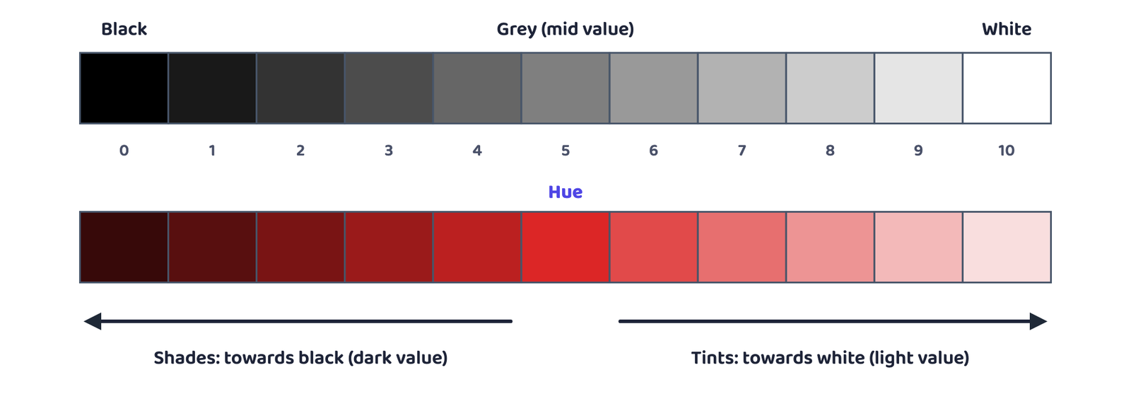
- Value describes the lightness or darkness of a hue, referred to as a tint or a shade
- White has the maximum value; black has the least
- The Grey Scale and Value Chart are an 11-grade scale (0 to 10) for judging value
- It shows 0 for black, 10 for white and 5 as the mid value for grey or hue
- The grey scale also helps us judge the equivalent value of any hue
- Shades (0 to 5) are the dark values; tints (10 to 5) are the light values
When a hue approaches white, it is a tint.
When a hue approaches black, it is a shade.
5.6 Chroma or intensity
- Chroma or intensity is the brightness or purity of a colour
- Dullness results when a colour is blended with another colour, specifically with the colour opposite to it on the colour wheel
5.7 Recognising colour and the Pantone shade card
- Most of us with normal eyesight can tell values and intensities apart and name them, e.g. brick red, blood red, tomato red, ruby red, carrot red
- Colour names come from natural sources: flowers, trees, woods; food, fruits, vegetables, spices; birds, animals, fur; stones and metals, minerals, earth; pigments and paints
- Names often have a regional flavour, so a name used in one area may not mean the same to people of another area
- With international trade in many goods, especially textile products, a system of using numbers along with names has been devised
A card that shows all possible hues, tints and shades in varying intensities, each with a code number recognised internationally.
- It helps in fashion forecasting
- It helps when orders for products are given in foreign lands
- The book shows a Pantone shade card, a Pantone colour chart made for a specific order, and Pantone colours in pens
6 Colour in fabric: the stage at which colour is added
Some fabrics have one uniform solid colour, in others the colour seems to follow the yarn interlacing, and still others carry colour in any shape. The stage of fabric production at which colour is added gives a vast range of designs.
| Stage | What happens | Examples / result |
|---|---|---|
| (a) Fibre stage | Very rarely done, because it is the most expensive process | Used for some manufactured fibres that are not easily dyed, or when a yarn with multicoloured fibres is needed |
| (b) Yarn stage | Creates multifarious designs | Woven stripes, checks, plaids, simple chambrays; brocade and Jacquard patterns woven from dyed yarns; tie-dyed yarns give Ikat |
| (c) Fabric stage (dyeing) | The most common method | Simple single-coloured fabrics; designed materials through tie and batik |
| (d) Fabric stage (other methods) | Colour can be applied in any shape and form | Painting, printing, embroidery, patch or appliqué work |
- Textile designers need a sound knowledge of the dyeing properties of different fibres and fabrics
- Depending on what the final product needs, they decide the stage and technique of colour application
7 Colour schemes or colour harmonies
- Certain basic colour schemes are used as guides for combining colours
- A colour scheme only suggests which hues can be combined
- The values and intensities of the hues, and the quantity of each, are decided by the designer or the consumer
- Colour schemes are best studied with the colour wheel
- There are two groups: related and contrasting
7.1 Related schemes (at least one hue in common)
| Scheme | Meaning |
|---|---|
| (a) Monochromatic harmony | Based on one hue, varied in value and/or intensity |
| (b) Achromatic harmony | Uses only neutrals, such as black and white |
| (c) Accented neutral | One hue + a neutral or achromatic colour |
| (d) Analogous harmony | Two or three hues side by side on the wheel; four or more hues may create a jumble unless each one is used in a very small quantity |
7.2 Contrasting schemes
| Scheme | Meaning |
|---|---|
| (a) Complementary harmony | Two hues lying directly opposite each other on the wheel |
| (b) Double complementary | Two pairs of complements, generally neighbours on the wheel |
| (c) Split complementary harmony | A three-colour combination: a hue, its complement and a neighbour; or a hue and the two neighbours of its complement |
| (d) Analogous complementary | A combination of analogous and complementary schemes: a complement chosen for dominance in a group of neighbouring colours |
| (e) Triadic harmony | Three hues lying equidistant from one another on the wheel |
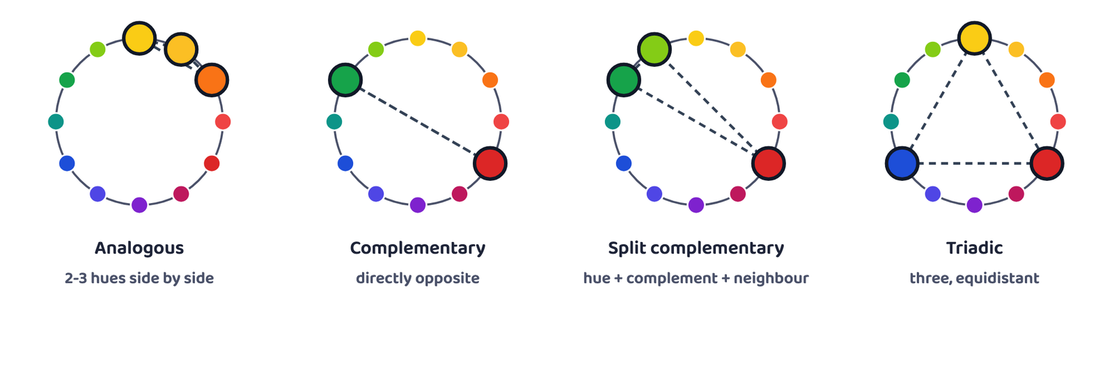
Related = 4 · Contrasting = 5
In a related scheme the colours are “relatives” sharing at least one hue (mono, achro, accented neutral, analogous). In a contrasting scheme they come from across the wheel (complementary, double, split, analogous complementary, triadic).
8 Element 2: texture
Texture is the sensory impression of sight and touch; it refers to the tactile and visual qualities of a material.
Every material, textile or otherwise, has its own texture. It is described in three ways:
| Ask | Words used |
|---|---|
| 1. How it looks | shiny, dull, opaque, dense, transparent, translucent, glossy |
| 2. How it behaves | hangs limp, stiff, sticking out, clinging, flowing out |
| 3. How it feels | soft, crisp, harsh, smooth, rough, coarse, grainy, pebbly |
8.1 Factors that decide the texture of textile materials
These were learnt in the Class XI chapter ‘Fabrics Around Us’. In summary:
Fibre content
Fibre type (natural or man-made), its length and fineness, and its surface characteristics.
Yarn processing and yarn type
Method of processing, twist given during processing, fineness of the yarn, and yarn type (simple, complex, novelty or textured).
Fabric construction technique
Weaving (type of weave and its compactness), knitting, felting, braiding, lace-making.
Fabric finishes
Stiffening (starching, sizing or gumming), ironing, calendaring and tentering, napping, fulling.
Surface ornamentation
Tufting, flock printing, embroidery and stitched effects.
8.2 Texture in dress
- The main purpose of texture in dress design is to create interest and to enhance the desirable features of the person
- Textures used together should have a pleasing relationship to each other to achieve harmony
- Texture should suit the figure, personal characteristics, silhouette or form of the costume, and the occasion
9 Element 3: line
Line is a mark that connects two points; it has a beginning and an end.
- A line can also be formed as the outline of an object, shape or form
- Line defines the shape or the different parts of a silhouette
- As an element of design, line indicates the shape of things, provides movement and determines direction
- Line and shape together create the pattern or plan of every design; every decorative detail is a combination of lines and shapes
- There are two basic types: straight and curved
9.1 Straight lines
A straight line is a rigid, unbroken line. Its effect depends on its direction, and it can also express mood.
| Straight line | Movement it stresses | Effect |
|---|---|---|
| (a) Vertical | Up and down | Emphasises height; severe, dignified and reserved |
| (b) Horizontal | Side to side | Illusion of width; repeats the ground line, so stable and placid |
| (c) Oblique or diagonal | Depends on the degree and direction of the angle | Increases or decreases width and height; active, startling or dramatic |
9.2 Curved lines
A curved line is one with any degree of roundness.
- It can be a simple arc or a complicated free-hand curve; the degree of roundness decides the curve
- A slight degree of roundness is a restrained curve; a great degree of roundness gives a circular curve
- Some curves are named after objects: parabola, scroll, meander, hairpin, whiplash, serpentine, figure of 8, ogee
- (a) Long, flowing curves look the most graceful and rhythmic
- (b) Large rounded curves give a dramatic touch and tend to exaggerate size
- (c) Tiny, puffy curves look youthful and gay (cheerful)
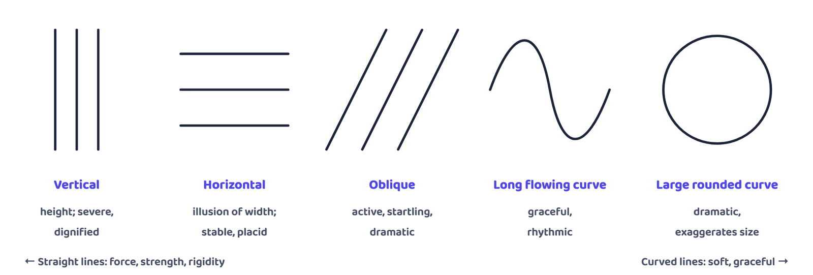
Straight lines
- Show force, strength and rigidity
- If dominant, the design effect is masculine
Curved lines
- Look soft and graceful
- Give an impression of feminity and daintiness
10 Element 4: shapes or forms, and pattern
- Shapes are made by connecting lines
- Two-dimensional shapes: a drawing or print on paper or fabric
- Three-dimensional shapes: an object seen from three or more sides, like a human body or the garments on it
- Since shapes are formed by lines, the kind of lines used decides the kind of shape; a shape of only straight lines differs from one of only curved lines
10.1 The four basic groups of shapes
| Group | How to recognise it |
|---|---|
| 1. Natural shapes | Copy nature or common shapes of man-made objects |
| 2. Stylised shapes | Simplified or modified natural shapes; some part may be distorted or exaggerated |
| 3. Geometric shapes | Mathematically formed (or give that impression); made with rulers, compasses or other measuring instruments |
| 4. Abstract shapes | Free-form; resemble no specific object, but may mean different things to different people through personal association |
- In fabric, shape and form refer to the fall or drape of the material, the shape of ornamentation and motifs, and the placement or repeat, i.e. the final pattern
- In apparel, they refer to the silhouette, the cut and the final detailing
A pattern is formed when shapes are grouped together.
- The grouping may be of one shape or a combination of two or more types of shapes
- The arrangement can also be natural, stylised, geometric or abstract
11 Principles of design
Principles of design are the rules that govern how design elements are mixed in the most appropriate way.
- They are proportion, balance, emphasis, rhythm and harmony
- Each principle is a separate entity, but combining them successfully produces an appealing product
- A successful design depends on understanding these basic principles
11.1 Proportion
Proportion concerns the relation of one part of an object to another.
- A good design does not permit easy dissection: the elements are blended so skilfully that where one ends and the next begins is not apparent
- The relationship may be created in size, colour, shape and texture, related to each other and to the whole
- It is generally based on the golden mean, shown by ratios like 3:5:8 to 5:8:13
- The smaller part 3 has the same relationship to the larger part 5 as the larger part 5 has to the whole 8
- A garment is divided horizontally into 3:5, 5:8 or 8:13 sections, which appear at the waist line, yoke and hemline
- A skirt and blouse dress looks pleasing if the blouse is 3, the skirt 5 and the total 8; in a shirt-pant dress the shirt is 5, the pant 8 and the combined effect 13
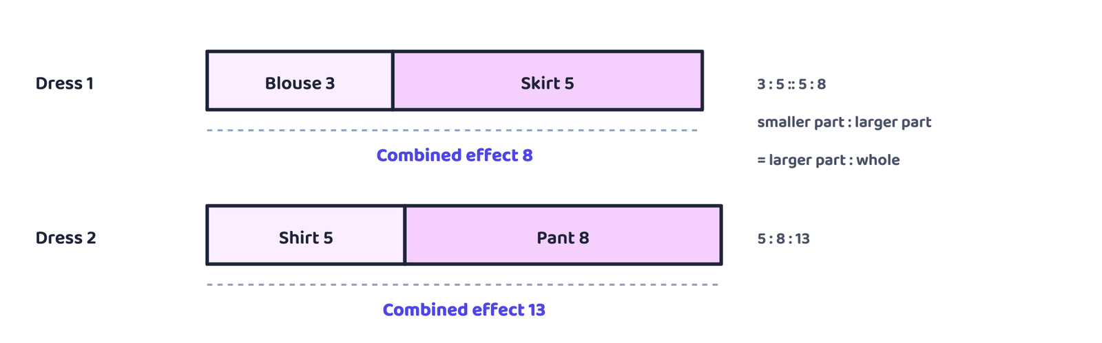
Proportion of colour
Different colours worn as shirt and pant, divided by the golden mean.
Proportion of texture
Textures can make the wearer look bigger or smaller; heavy and bulky textures look overpowering on a thin and petite person.
Proportion of shape and form
The size and position of motifs or prints suit the size of the wearer; a high waist bodice in maternity clothes camouflages the fullness of the abdomen.
Equal divisions
- Make a person look shorter and wider
Unequal horizontal divisions
- Make a person look slimmer
The width of the figure, length of the waist or torso and length of the legs may differ from the classic ideal figure. Clothing modifies the figure and turns awkward body proportions into pleasing ones.
11.2 Balance
Balance is defined as equalling the distribution of weight from the central point of the garment.
- A garment needs balance both vertically (from the centre line) and horizontally (from top to bottom)
- It can be achieved in three ways: formal, informal and radial
- All the elements (line, form, colour, texture) are considered while creating balance in a dress
- An average human body is symmetrical: it looks the same on each side of a central vertical line
- Two arms, two eyes and two legs sit on either side of the central axis, though slight differences still occur
- If the body differs noticeably on one side, carefully designed clothes can minimise the difference
- Formal vertical balance is the least expensive and most expected type of design, found on less expensive garments
- It gives a feeling of stability, dignity and formality, but tends to get monotonous
It is basically used to correct figure problems with the elements of design, for example a dark hue for a big size.
11.3 Emphasis (focal point)
The emphasis or focal point of a garment is the area that first attracts the viewer’s eye.
- It adds interest to the garment
- It may be created by colour, design lines, detailing or accessories
- Emphasis creates centres of interest by focussing attention on a specific area of the garment
- Details that focus on the face are particularly effective, because the face is the focal point of beauty in our culture
- A beautiful embroidered yoke or a contrasting colour blouse further emphasises the face
- Emphasis can be created with contrasting colours, unusual shapes, lines and textures
✓ Emphasise what you want seen
- A woman with a small waist can wear a bright, contrasting belt to emphasise this positive part of her figure
✗ Do not emphasise what you want hidden
- A woman with large hips who wears a hip belt or other details at the hip area only highlights it further
11.4 Rhythm
Rhythm is the repeating of lines, colours, other elements of design or details to create a pattern by which the eye can flow through the material or garment.
Rhythm uses lines, shapes, colours and textures so that the design shows visual unity. It can be created by:
Repetition
Repeating embroidery, laces, buttons, piping or colour at necklines, sleeves and hemlines.
Cordation
A gradual increase or decrease in the size of motifs, lines, buttons, colours and textures.
Radiation
The eye moves in an organised way from a central point, e.g. gathers at the waist, yoke or cuffs.
Parallelism
Elements lie parallel to each other, e.g. tucks in a yoke or knife pleats in a skirt; bands of colour also give rhythm.
11.5 Harmony
Harmony or unity is created when all elements of design come together to give a pleasing, harmonious effect.
- It is a critical factor in producing marketable (publicly acceptable) designs
- Harmony by shape: all areas of the garment reflect the same shape; if the collar, cuffs and hem are curved, square pockets would interrupt the continuity of the design
- Harmony by texture: using the right texture when a dress has several pieces, as in a salwar, kurta and dupatta; a silk kurta and salwar with a cotton dupatta shows bad harmony

11.6 Composition
A composition is an artwork or concept developed by arranging the elements of design and applying the principles of design in the best possible way in a given space.
- To create a composition, the creator selects two or three principles that best suit the final artwork and give good visual appeal
- In other words, it is a play of the elements of design in a given space
- The space can be 2-dimensional or 3-dimensional
| Principle | In one line | Dress example |
|---|---|---|
| Proportion | Relation of one part to another | Blouse 3 : skirt 5 : whole 8 |
| Balance | Equal distribution of weight from the centre | Same on both sides of the centre line (formal) |
| Emphasis | The area that first catches the eye | Embroidered yoke near the face, contrasting belt |
| Rhythm | Repeating elements so the eye flows | Same lace at neckline, sleeves and hemline |
| Harmony | All elements together give one effect | Silk kurta and salwar with a silk dupatta |
12 Preparing for a career, and scope
12.1 Preparing for a career
- The field of design for fabric and apparel has become so vast that it can be considered as two specialisations
- Fabric is now used in many things other than apparel and household articles
- Apparel, in turn, uses materials other than just fabric
- Each use has its own needs in appearance, durability and cost
- Fibre characteristics, their advantages and limitations, and their processing
- The dyeing properties of different fibres and fabrics
- How to decide the stage and technique of colour application for the final product
- The principles of design
- Various institutes offer long and short term courses
- They lead to a certificate, a diploma, an associate or a bachelors degree
- The choice depends on several factors and on the unique qualities of each degree programme
12.2 Scope
- The design industry is a vibrant, varied and dynamic creative sector with an important role in many areas of our lives
- Textile design work demands awareness of changing trends and styles
- It needs designs that are fresh, current or even ahead of the fashion curve
- Textile designs for apparel fashion have a quicker turnaround than designs for furnishing
13 Practical work: applied textile design techniques
The CBSE 2026-27 and HBSE practical for this chapter: preparation of any one article using an applied textile design technique (tie and dye / batik / block printing). Practicals 1, 2 and 3 of the book cover these three techniques. All three are examples of applied design, because colour and design are put onto a fabric that has already been made.
13.1 Practical 1: tie and dye
The oldest form of designing with colour, in which a resist material (thread, pieces of fabric, or substances such as clay and wax) offers physical resistance to the dye.
- The most common method of resist is tying with thread
- In tie and dye, the areas meant to form the pattern are resisted by tightly wound thread
- When the fabric is dipped in dye, the resisted areas keep the original colour of the ground
- Bandhani, chunari and laheria are materials patterned by tie-dyeing the fabric after it is woven
- Bandhej: patterns of innumerable dots; laheria: diagonal stripes
- Gujarat and Rajasthan are the homes of these fabrics
- Purposes: (1) the concept of tie and dye (2) the process through various techniques (3) eye and hand coordination (4) understanding curves and shades on the patterns
- Start by observing shapes of leaves and flowers in nature, drawing them in pencil and shading them to create depth
- Resist can be given with threads of different thickness, or by the fabric itself through knotting, crumpling or folding and then tying over it
| Technique | How it is done | Result / special point |
|---|---|---|
| 1. Knotting | Knots tied in several ways, depending on the size, shape and grain of the fabric | Easiest and quickest; best on fine fabric; shaded circular patterns |
| 2. Marbling | (i) Fabric gathered into a ball and tied in all directions into a solid mass; (ii) fabric twisted and coiled lengthwise and tied | Variegated, irregular cloud-like effects; usually dyed in light colours, repeated in two or more colours; a multicoloured background for later tie-dyeing |
| 3. Binding | Parts bound very tightly with thread before dyeing, as a dot, band, line, criss-cross or spiral | Stripes, straight or diagonal (lehria); circles or spots (bandhej) |
| 4. Tritik or sewing | Simple tacking stitches along a pattern with a strong thread knotted at the start; pulled to gather the cloth and knotted again | Pleasing bands of dotted textures of various shapes |
| 5. Folding | Folded as pleats, squares or triangles; held with binding or clips | Symmetrical stripes, bands, squares; best on thick materials (the fabric itself forms the resist); later a background for block printing and embroidery |

Before tying, wash the fabric in hot soapy water so that the dye is absorbed evenly. After tying, dye the cloth by a simple dyeing method. In class, make the designs on small samples of white cotton cloth.
13.2 Practical 2: batik
Batik is a form of resist printing in which the resist is obtained by applying wax on the fabric in a design.
- Dyeing is done in cold so that the wax does not melt, which confines the colour to the unwaxed area
- Selective waxing and re-dyeing give a variety of colourings
- The beauty of batik: cracks form in the wax during dyeing and colour enters through these cracks
- Purposes: (1) the concept of batik (2) the process of batik by preparing an article
Light wax
- Essentially paraffin wax
- Easily removed
Darker wax
- Essentially bees wax
- More adhesive
Both waxes are taken in varied proportions to get various types of cracks.
The usual tools are brushes of various widths and sizes with natural hair bristles (not nylon or thermoplastic). Wax is applied by four methods:
Painting
Painting the design area with wax.
Outlining
Painting the outline of the design or motif with wax.
Dry brushing
A flat brush free of excess wax is carried along the design lines to give a shaded effect.
Scratching
A part of the fabric is covered with wax and the design line is scratched with the back of a pin or brush.
13.3 Practical 3: block printing
- Block printing is one of the oldest methods of applying a design onto fabric
- A separate block is needed for each colour in the finished design
- The design area of the block is raised, and the background that is not to be printed is carved away
- Most blocks are made of wood; metal may be used to reinforce parts of the design
- Blocks may carry single motif patterns, border patterns or all-over patterns
- Purposes: (1) the concept of block printing (2) the process of block printing
| Point | Tie and dye | Batik | Block printing |
|---|---|---|---|
| Resist / tool | Thread, knots, folds, stitches | Wax | Raised wooden block |
| How colour goes on | Dipping in dye | Cold dyeing (below 35°C) | Pressing dye paste |
| Identifying feature | Laheria, bandhej, cloud effects | Colour in the wax cracks | One block for each colour |
- Activity 1: collect samples of fabric, printed paper and pictures of dresses and room interiors, and analyse their colour harmonies, stating hue, value and intensity
- Activity 2: collect textile samples of different textures, describe each texture in suitable terms (shiny, stiff, smooth) and analyse the factors that produced it
- Design = the human power to conceive, plan and realise products; not mere decoration
- Structural design depends on form; applied design is superimposed on the basic structure
- Elements: colour, texture, line, shape/form, pattern · Principles: proportion, balance, emphasis, rhythm, harmony
- VIBGYOR; green, blue and purple recede, red, orange and yellow advance
- Primary: red, yellow, blue · Secondary: orange, green, violet · Tertiary: 6 · Neutrals = achromatics
- Grey scale: 11 grades, black 0, white 10, mid 5 · towards white = tint, towards black = shade
- Pantone shade card: international code numbers, fashion forecasting, foreign orders
- Colour stages: fibre (rare, costly), yarn (Ikat, Jacquard, brocade), fabric (most common)
- Related schemes 4, contrasting schemes 5; complementary = opposite, triadic = equidistant
- Vertical line height, horizontal width, oblique dramatic; straight masculine, curved dainty
- Four groups of shapes: natural, stylised, geometric, abstract
- Golden mean 3:5:8, 5:8:13; unequal divisions make a person look slimmer
- Balance: formal, informal, radial; formal is least expensive but monotonous
- Rhythm: repetition, cordation, radiation, parallelism · Composition: 2 or 3 principles in a given space
- Batik: paraffin + bees wax, dye below 35°C · Block printing: darkest outline block first
- Can I write the book’s definition of design?
- Can I draw Munsell’s colour wheel and show the three types of colour?
- Do I know all the related and contrasting colour schemes?
- Can I list the five factors that decide texture?
- Can I explain how to achieve rhythm and harmony in a dress, with examples?
- Can I write the five tie and dye techniques and the steps of batik?