- What “data” actually means, and how it differs from “information”
- Where geographers get their data from, every primary and secondary source, and how to tell them apart
- How raw, jumbled numbers get turned into a usable statistical table
- How to group data into classes and build a frequency distribution by hand
- How to read and draw a frequency polygon and an Ogive
1 What Is Data, and Why Is It Needed
You see data every day without calling it that: the temperatures shown at the end of a TV news bulletin, or the population and crop figures printed in a geography book.
Data are numbers that represent measurements from the real world, for example “20 cm of rain in Barmer” or “the New Delhi to Mumbai distance via Kota-Vadodara is 1,385 km.” A datum is a single measurement.
Information is a meaningful answer to a query, or a meaningful stimulus that can lead to further queries. Raw data becomes information only after it is processed: derived mathematically, deduced logically, or calculated statistically.
“Differentiate between data and information” is a standard 30 word question. The one line answer: data is raw, unprocessed measurement; information is the meaningful conclusion drawn after processing that data.
Data is not collected for its own sake. Maps alone cannot explain how phenomena on the earth’s surface are related; that needs statistical analysis of data. Studying a region’s cropping pattern needs data on cropped area, yield, irrigated area and rainfall; studying a city’s growth needs data on population, density, migrants, occupation, industries and transport.
1.1 Presentation of Data
Collecting data is only half the job; presenting it correctly matters just as much, because a single summary number can hide the real situation.
A man crossing a river with his wife and five year old child measured its depth at four points: 0.6, 0.8, 0.9 and 1.5 metres. He calculated the average depth as 0.95 m, less than his child’s 1 m height, so he let the child cross. The child drowned, because one point was 1.5 m deep. This is called a statistical fallacy: an average can hide the truth about individual values, so how data is presented matters as much as collecting it.
Modern geography has shifted from purely qualitative description to quantitative analysis, so analytical tools and techniques, from collecting data right through to drawing conclusions, have become essential.
2 Sources of Data: Primary and Secondary
Primary sources are data collected for the first time by an individual, a group, or an institution. Secondary sources are data already collected and available in published or unpublished form.
Based on NCERT Fig. 1.1, “Methods of Data Collection.”
3 Sources of Primary Data
3.1 Four Ways to Collect Primary Data
Personal Observation
Information collected through direct field observation: relief, drainage, soil, vegetation, population structure, sex ratio, literacy, transport. The observer needs theoretical knowledge and a scientific, unbiased attitude.
Interview
The researcher gets information directly from the respondent through dialogue. Success depends entirely on how the interview is conducted.
Questionnaire / Schedule
Structured questions with space for answers, given to the respondent or filled by a trained enumerator.
Other Methods
Direct field measurement: soil kit, water quality kit, and transducers used by field scientists to measure crop and vegetation health.
(i) Prepare a precise list of the information needed. (ii) Be clear about the survey’s objective. (iii) Take the respondent into confidence before asking sensitive questions and assure secrecy. (iv) Create a comfortable atmosphere. (v) Keep the language simple and polite. (vi) Never ask a question that hurts self respect or religious feelings. (vii) At the end, ask if there is anything more they can add. (viii) Thank them for their time.
3.2 Questionnaire vs Schedule
Questionnaire
- The respondent fills it in themselves
- Needs the respondent to be literate
- Can be mailed to distant places
- Good for surveying a large area cheaply
Schedule
- A trained enumerator fills it, by asking the respondent
- Works even with illiterate respondents
- Needs enumerators to travel and ask in person
- More reliable, but more expensive to run
Students write “questionnaire and schedule are the same thing.” They are not: the only difference NCERT tests is who fills it in, the respondent (questionnaire) or a trained enumerator (schedule). That single distinction is the whole answer.
4 Secondary Source of Data
Secondary sources are published and unpublished records already prepared by someone else.
4.1 Published Sources
| Type | What it covers | Examples from the book |
|---|---|---|
| Government Publications | Publications of ministries, departments, state governments and District Bulletins | Census of India, National Sample Survey reports, IMD Weather Reports, state Statistical Abstracts |
| Semi/Quasi-government Publications | Reports of urban and local bodies | Urban Development Authorities, Municipal Corporations, Zila Parishads |
| International Publications | Yearbooks and reports of UN agencies | UNESCO, UNDP, WHO, FAO; Demographic Year Book, Statistical Year Book, Human Development Report |
| Private Publications | Yearbooks and research reports by private bodies | Newspapers’ and private organisations’ surveys and monographs |
| Newspapers and Magazines | Daily, weekly, fortnightly, monthly | Easily accessible, regularly updated |
| Electronic Media | The internet | Now a major source of secondary data |
4.2 Unpublished Sources
| Type | Example |
|---|---|
| Government Documents | Village-level revenue records maintained by the patwari |
| Quasi-government Records | Periodical reports and development plans of Municipal Corporations, District Councils, Civil Services departments |
| Private Documents | Unpublished reports of companies, trade unions, political/apolitical organisations, and residents’ welfare associations |
5 Tabulation and Classification of Data
Data collected from any source first appears as a big, jumbled mass with little sense to it, this is called raw data. To draw useful conclusions, raw data must be tabulated and classified.
A Statistical Table is a systematic arrangement of data in columns and rows. It simplifies presentation, makes comparison easy, and lets the reader locate information quickly, presenting a huge mass of data in a minimum of space.
6 Data Compilation and Presentation
Once tabulated, data can be presented in three forms: absolute, percentage/ratio, or index numbers.
6.1 Absolute Data
Data presented in their original form, as whole numbers: total population, total crop production, and so on.
| State/UT | Persons | Males | Females |
|---|---|---|---|
| India (total) | 1,21,05,69,573 | 62,31,21,843 | 58,74,47,730 |
| Uttar Pradesh | 19,98,12,341 | 10,44,80,510 | 9,53,31,831 |
| Bihar | 10,40,99,452 | 5,42,78,157 | 4,98,21,295 |
| Rajasthan | 6,85,48,437 | 3,55,50,997 | 3,29,97,440 |
| Punjab | 2,77,43,338 | 1,46,39,465 | 1,31,03,873 |
Based on NCERT Table 1.1, Census 2011 (extract).
6.2 Percentage / Ratio
Data expressed as a ratio or percentage, computed from a common parameter. Literacy rate and population growth rate are the classic examples.
| Year | Persons (%) | Male (%) | Female (%) |
|---|---|---|---|
| 1951 | 18.33 | 27.16 | 8.86 |
| 1981 | 43.57 | 56.38 | 29.76 |
| 2001 | 64.84 | 75.85 | 54.16 |
| 2011 | 73.0 | 80.9 | 64.6 |
Based on NCERT Table 1.2, “Literacy Rate: 1951 to 2011” (Census 2011).
6.3 Index Number
An Index Number is a statistical measure that shows changes in a variable, or a group of related variables, with respect to time, location or other characteristics. It is widely used in economics and business to track changes in price and quantity.
Given
NCERT’s iron ore example: base year 1970-71 production = 32.5 million tonnes
Find
Index numbers for 1980-81, 1990-91 and 2000-01
1980-81: $\frac{42.2}{32.5}\times100 = $ 130
1990-91: $\frac{53.7}{32.5}\times100 = $ 165
2000-01: $\frac{67.4}{32.5}\times100 = $ 207
Based on NCERT Table 1.3, Source: India, Economic Year Book, 2005.
7 Grouping and Classifying Data
Raw data must be tabulated and classified before it means anything. NCERT’s own example: the marks of 60 students in a Geography paper, given as one long, ungrouped list ranging from 02 to 96.
7.1 Grouping of Data
Grouping raw data means deciding two things, the number of classes and the class interval, and both depend on the range of the raw data. Since the 60 marks range from 02 to 96, NCERT groups them into 10 classes of interval 10 each: 0-10, 10-20, 20-30 and so on up to 90-100.
7.2 Classification and Tally Marks
Once the classes are fixed, each observation gets one tally mark in its group, a method popularly called the Four and Cross Method. For example, the first raw score, 47, falls in the 40-50 group, so a tally mark is recorded there.
7.3 Frequency Distribution
Simple frequency (f) is the number of individuals falling in each class. Cumulative frequency (Cf) is obtained by adding each simple frequency to the running total of all frequencies before it. The sum of all simple frequencies always equals the total number of observations, written .
| Marks (class) | Frequency (f) | Cumulative frequency (Cf) |
|---|---|---|
| 0-10 | 4 | 4 |
| 10-20 | 5 | 9 |
| 20-30 | 5 | 14 |
| 30-40 | 7 | 21 |
| 40-50 | 6 | 27 |
| 50-60 | 10 | 37 |
| 60-70 | 8 | 45 |
| 70-80 | 6 | 51 |
| 80-90 | 5 | 56 |
| 90-100 | 4 | 60 |
Based on NCERT Table 1.6. Reading it: 27 students scored below 50; 45 of the 60 students scored below 70. That is the whole use of a cumulative frequency table.
7.4 Exclusive Method vs Inclusive Method
These are the two ways a class interval can be written, and NCERT tests the difference directly.
Exclusive Method
- Written as 20-30, 30-40 and so on
- The upper limit of one class equals the lower limit of the next
- A value equal to 30 is placed in the lower class (30-40), excluded from the upper one (20-30)
Inclusive Method
- Written as 20-29, 30-39 and so on
- The upper limit of a class differs from the next class’s lower limit by 1
- A value equal to a class’s own upper limit stays in that same class
Both methods still span 10 units per class; only how the boundary value is treated changes.
8 Frequency Polygon and Ogive
A graph of a frequency distribution is called a frequency polygon. It is useful for comparing two or more frequency distributions at a glance.
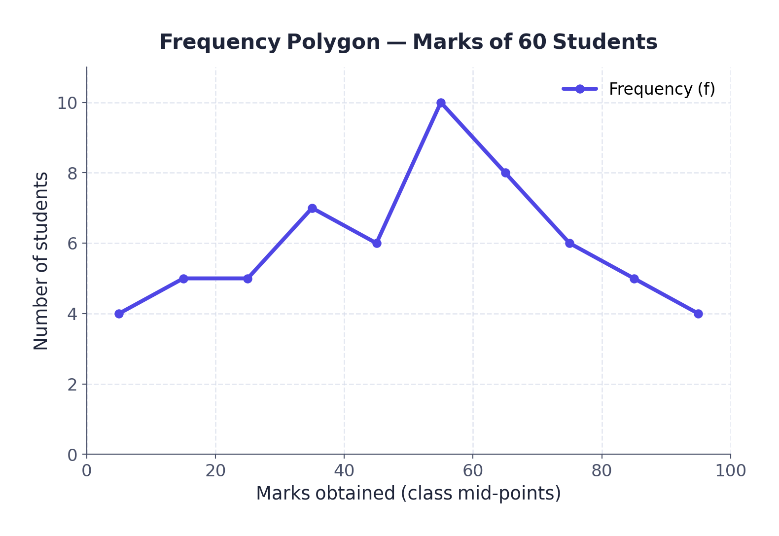
An Ogive (pronounced “ojive”) is the curve obtained by plotting cumulative frequencies. It is built by either the Less Than method or the More Than method.
Less Than Method
- Start from the upper limit of each class
- Keep adding frequencies
- Gives a rising curve
More Than Method
- Start from the lower limit of each class
- Subtract each class’s frequency from the cumulative total
- Gives a declining curve
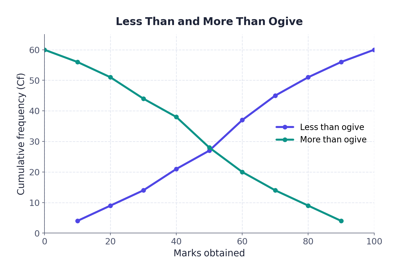
NCERT’s own Fig. 1.8 combines both ogives on one graph for “a comparative picture.” Practise plotting both curves from a single frequency table using graph paper; this is a favourite 3 to 5 mark graph question.
- Can I define data, information, primary source and secondary source without looking?
- Can I list all four methods of collecting primary data and all six published secondary sources?
- Can I state the one real difference between a questionnaire and a schedule?
- Can I calculate an index number from given production figures?
- Can I explain the difference between the exclusive and inclusive methods with an example?
- Can I read a cumulative frequency table and say how many observations lie below a given value?
- Data = raw measurements from the real world. Information = the meaningful conclusion drawn after processing data
- Sources of data: Primary (collected first hand) and Secondary (already published or recorded)
- Primary methods: personal observation, interview, questionnaire/schedule, other field methods (soil kit, transducers)
- Secondary, published: government, quasi-government, international, private, newspapers, electronic media. Unpublished: government, quasi-government and private documents
- A questionnaire is filled by the respondent; a schedule is filled by a trained enumerator, which is what makes a schedule usable with illiterate respondents too
- Raw data becomes a Statistical Table, then gets presented as absolute figures, percentages/ratios, or index numbers
- Index Number = (current year total ÷ base year total) × 100, base year = 100
- Grouping raw data needs a class interval and a number of classes, both fixed by the data’s range
- Frequency (f) = count per class. Cumulative frequency (Cf) = running total.
- Exclusive method: the upper limit is excluded from its own class. Inclusive method: the upper limit stays in its own class
- Frequency polygon compares distributions. Ogive plots cumulative frequency by the Less Than or More Than method
- 1 markA number or character that represents measurement is called
(a) Digit(b) Data(c) Number(d) Character - 1 markA single datum is a single measurement from the
(a) Table(b) Frequency(c) Real world(d) Information - 1 markIn tally marking, grouping by four and crossing the fifth is called
(a) Four and Cross Method(b) Tally Marking Method(c) Frequency Plotting Method(d) Inclusive Method - 1 markAn Ogive is a method in which
(a) Simple frequency is measured(b) Cumulative frequency is measured(c) Simple frequency is plotted(d) Cumulative frequency is plotted - 1 markIf both ends of a group are taken in frequency grouping, it is called
(a) Exclusive Method(b) Inclusive Method(c) Marking Method(d) Statistical Method - 1 markThe Census of India is published by the
(a) National Sample Survey(b) Office of the Registrar General of India(c) UNDP(d) Indian Meteorological Department - 1 markWhich of these is an unpublished source of secondary data?
(a) Newspaper(b) Statistical Year Book(c) Village revenue records kept by the patwari(d) Census report - 1 markIn a schedule, the form is filled by
(a) The respondent, by mail(b) A trained enumerator(c) A government office(d) A computer
Reason (R): A questionnaire must be filled in by the respondent themselves, while a schedule is filled by a trained enumerator who asks the questions.
Reason (R): In the exclusive method, the upper limit of one class is excluded and instead becomes the lower limit of the next class.
Reason (R): In 2011, India’s female literacy rate was 64.6%, while the male literacy rate was 80.9%.
- 2 marksDifferentiate between data and information.
- 2 marksWhat do you understand by data processing?
- 2 marksWhat is the advantage of a footnote in a statistical table?
- 2 marksWhat do you mean by primary sources of data?
- 2 marksEnumerate five sources of secondary data.
- 2 marksWhat is the exclusive method of frequency classification?
- 2 marksDefine a statistical table in your own words.
- 2 marksWhat is meant by “raw data”?
- 4 marksDiscuss the national and international agencies from where secondary data may be collected.
- 4 marksWhat is the importance of an index number? Taking an example, examine the process of calculating an index number and show the changes.
- 4 marksExplain, with the help of the interview method’s precautions, why the way a survey is conducted matters as much as the questions asked.
- 4 marksDistinguish between the questionnaire method and the schedule method of data collection, and explain why the schedule method is more inclusive.
- 4 marksDescribe how raw data is grouped into a frequency distribution, using the marks of 60 students example.
- 4 marksExplain the difference between the “Less Than” and “More Than” methods of drawing an Ogive.
- 3 marksCalculate the index number for a commodity whose production rose from 500 tonnes in the base year to 650 tonnes in the current year.
- 3 marksA class interval is written as 30-39 in one table and 30-40 in another. Identify which method each uses, and explain the difference in how the value 30 is treated.
- 3 marksFrom a cumulative frequency table where Cf at “less than 50” is 27 and total N is 60, state how many students scored 50 or more.
- 1 markState the formula used to calculate the literacy rate of a region.
- 1 markName the curve obtained by plotting cumulative frequencies.
- 2 marksList any four government publications that serve as sources of secondary data in India.
- 2 marksWhy is the internet now considered a major source of secondary data?
- 2 marksExplain the “statistical fallacy” illustrated by the river-crossing example in this chapter.