- Why geographers turn raw data into graphs, diagrams and maps instead of leaving it as a table
- The three things every good diagram or map must get right: method, scale and design
- How to construct a line graph, a polygraph and all four kinds of bar diagram
- How to calculate angles and draw a pie diagram from raw data or percentages
- What a flow map is and how a thematic map differs from an ordinary graph
- How to construct a dot map, a choropleth map and an isopleth map, and how interpolation works
1 Representation of Data
Data collected by geographers, economists and resource scientists can be kept as a table of numbers, or turned into a picture: a graph, a diagram, a map or a chart. This transformation of data through visual methods is called representation of data. A table of numbers takes time to read and compare; a picture shows the pattern, growth, distribution, density, the moment you look at it.
Representation of data is the transformation of data through visual methods such as graphs, diagrams, maps and charts, so that patterns of distribution, growth and density become easy to see and compare.
A picture is equivalent to thousands of words.
old Chinese proverb the chapter opens with
2 Three Golden Rules for Every Diagram or Map
Before drawing anything, three decisions have to be made correctly. Get any one wrong and the diagram misleads instead of informs.
2.1 Method, scale and design
Selection of a suitable method
The kind of data decides the method. Temperature or population growth over time → line graph. Rainfall or production of a commodity → bar diagram. Distribution of population or livestock → dot map. Population density → choropleth map.
Selection of a suitable scale
The scale measures the data on the diagram or map. It must cover the entire data range and should be neither too large nor too small: too large wastes space, too small makes differences invisible.
Design
Three parts of the design must always be shown: Title (area, reference year, caption, centred at the top), Legend (explains colours, shades, symbols, usually lower-left or lower-right), and Direction (the North symbol, since a map represents part of the earth’s surface).
“Design” is a favourite short-answer topic. Remember it as T-L-D: Title, Legend, Direction: three components, three marks.
3 Classification of Diagrams by Dimension
Data has measurable characteristics: length, width, volume. Diagrams and maps drawn to represent these are grouped into three classes by how many dimensions they use.
| Class | Meaning | Examples |
|---|---|---|
| One-dimensional | Length alone carries the value | Line graph, polygraph, bar diagram, histogram, age-sex pyramid |
| Two-dimensional | Length and width (area) carry the value | Pie diagram, rectangular diagram |
| Three-dimensional | Length, width and height (volume) carry the value | Cube diagram, spherical diagram |
Histogram, age-sex pyramid, rectangular diagram, cube diagram and spherical diagram are only named in this classification. This chapter does not teach how to construct them (they belong to a different practical geography book). Do not answer a construction question about them from this chapter.
Because of time, the chapter itself explains construction for only five methods in detail: line graphs, bar diagrams, the pie diagram, and flow charts, plus, separately, thematic maps (dot, choropleth and isopleth). A sixth, the wind rose and star diagram, is named in the chapter’s own list but its construction is never explained in the text. Know that it exists as a diagram used to show wind direction and speed; nothing more is examinable from this chapter.
4 Line Graph and Polygraph
4.1 Line graph
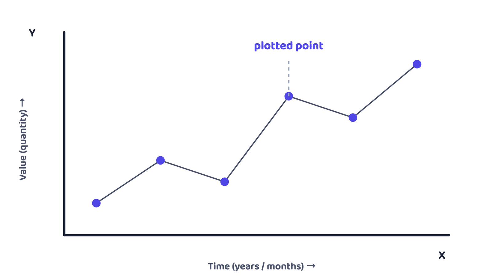
A line graph is drawn to represent time-series data, such as temperature, rainfall, population growth, or birth and death rates, as a line joining plotted points.
Construct a line graph for the growth rate of population in India, 1901-2011.
| Year | 1911 | 1921 | 1931 | 1941 | 1951 | 1961 | 1971 | 1981 | 1991 | 2001 | 2011 |
|---|---|---|---|---|---|---|---|---|---|---|---|
| Growth rate (%) | 0.56 | −0.30 | 1.04 | 1.33 | 1.25 | 1.96 | 2.20 | 2.22 | 2.14 | 1.93 | 1.79 |
Years go on the X-axis, growth rate (%) on the Y-axis. Because 1921 has a negative value, the Y-axis scale must extend below zero.
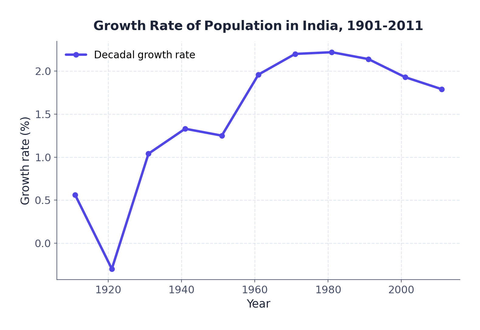
The chapter sets this as an activity: find out why population growth suddenly dipped between 1911 and 1921. Two events overlapped in those years, the First World War and the worldwide influenza pandemic of 1918, both of which raised death rates sharply. The book poses the question but does not give this answer in its own text.
4.2 Polygraph
A polygraph is a line graph in which two or more variables are shown by an equal number of lines, for immediate comparison, for example the growth rates of different crops, or the birth rate, death rate and sex ratio of different states.
Each line is drawn in a different style so the variables stay distinguishable: a straight line, a broken line, a dotted line, a dot-and-broken combination, or lines of different colours.
Compare the sex ratio (females per 1000 males) of three states, 1961-2011:
| State | 1961 | 1971 | 1981 | 1991 | 2001 | 2011 |
|---|---|---|---|---|---|---|
| Delhi | 785 | 801 | 808 | 827 | 821 | 866 |
| Haryana | 868 | 867 | 870 | 860 | 846 | 877 |
| Uttar Pradesh | 907 | 876 | 882 | 876 | 898 | 908 |
Source: Census, 2011
Three lines, one per state, all sharing the same X-axis (years) and Y-axis (sex ratio): that is what makes it a polygraph rather than three separate line graphs.
5 Bar Diagrams
A bar diagram (also called a columnar diagram) is drawn using columns of equal width.
A bar diagram represents data as a series of bars of equal width, placed at equal intervals, whose length or height is proportional to the value each bar stands for.
5.1 Rules for every bar diagram
Equal width
Every bar or column must be the same width.
Equal spacing
All bars stand at equal intervals apart.
Shading allowed
Bars may be shaded with colours or patterns to make them distinct and attractive.
5.2 Simple bar diagram
Used for immediate comparison. The data set is usually arranged ascending or descending, except time-series data, which stays in time order.
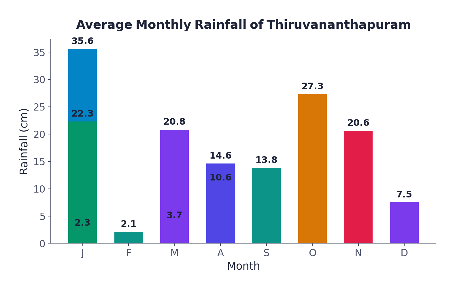
Average monthly rainfall of Thiruvananthapuram (in cm):
| Month | J | F | M | A | M | J | J | A | S | O | N | D |
|---|---|---|---|---|---|---|---|---|---|---|---|---|
| Rainfall (cm) | 2.3 | 2.1 | 3.7 | 10.6 | 20.8 | 35.6 | 22.3 | 14.6 | 13.8 | 27.3 | 20.6 | 7.5 |
Construction: draw X and Y axes on graph paper; take a Y-axis interval of 5 cm; divide the X-axis into 12 equal parts for the 12 months; plot each month’s rainfall at the chosen scale.
5.3 Line and bar graph combined
Two closely related characteristics, such as monthly temperature and rainfall, can be shown on one diagram: months on the X-axis, and the two variables on the Y-axis at both sides (temperature on the right, rainfall on the left, or vice versa). Temperature is plotted as a line, rainfall as bars.
Average monthly temperature and rainfall of Delhi:
| Month | Jan | Feb | Mar | Apr | May | Jun | Jul | Aug | Sep | Oct | Nov | Dec |
|---|---|---|---|---|---|---|---|---|---|---|---|---|
| Temp. (°C) | 14.4 | 16.7 | 23.3 | 30.0 | 33.3 | 33.3 | 30.0 | 29.4 | 28.9 | 25.6 | 19.4 | 15.6 |
| Rainfall (cm) | 2.5 | 1.5 | 1.3 | 1.0 | 1.8 | 7.4 | 19.3 | 17.8 | 11.9 | 1.3 | 0.2 | 1.0 |
Construction: divide the X-axis into 12 parts; choose a temperature scale (5°C or 10°C intervals) and label it on the right; choose a rainfall scale (5 cm or 10 cm intervals) and label it on the left; plot temperature as a line and rainfall as bars, on the same diagram.
5.4 Multiple bar diagram
Constructed to compare two or more variables side by side, for example male and female population, or total, rural and urban population, plotted as separate adjacent bars for each category.
Literacy rate in India, 1951-2011 (%):
| Year | Total population | Male | Female |
|---|---|---|---|
| 1951 | 18.33 | 27.16 | 8.86 |
| 1961 | 28.3 | 40.4 | 15.35 |
| 1971 | 34.45 | 45.96 | 21.97 |
| 1981 | 43.57 | 56.38 | 29.76 |
| 1991 | 52.21 | 64.13 | 39.29 |
| 2001 | 64.84 | 75.85 | 54.16 |
| 2011 | 73.0 | 80.9 | 64.6 |
Source: Census, 2011
Construction: time series on the X-axis, literacy rate on the Y-axis; plot total, male and female as three separate bars for each year.
5.5 Compound bar diagram
Used when several components of one variable, or several variables of one component, are grouped together: they are shown as different rectangles stacked inside a single bar, not as separate adjacent bars.
Gross generation of electricity in India (billion kWh):
| Year | Thermal | Hydro | Nuclear | Total |
|---|---|---|---|---|
| 2008-09 | 616.2 | 110.1 | 14.9 | 741.2 |
| 2009-10 | 677.1 | 104.1 | 18.6 | 799.8 |
| 2010-11 | 704.3 | 114.2 | 26.3 | 844.8 |
Source: Economic Survey, 2011-12
Construction: one bar per year, its total length equal to gross generation; divide that single bar’s length into thermal + hydro + nuclear segments.
Multiple bar diagram
- Each variable gets its own bar
- Bars stand side by side, in a group
- Compares variables directly against each other
Compound bar diagram
- All variables share ONE bar
- The bar is divided into segments
- Shows how the parts add up to the whole
“Multiple bar diagram vs compound bar diagram” is a standard 30-word exercise question. The difference is not the data: it is whether the variables sit in separate bars side by side (multiple) or segments of one bar (compound).
6 Pie Diagram
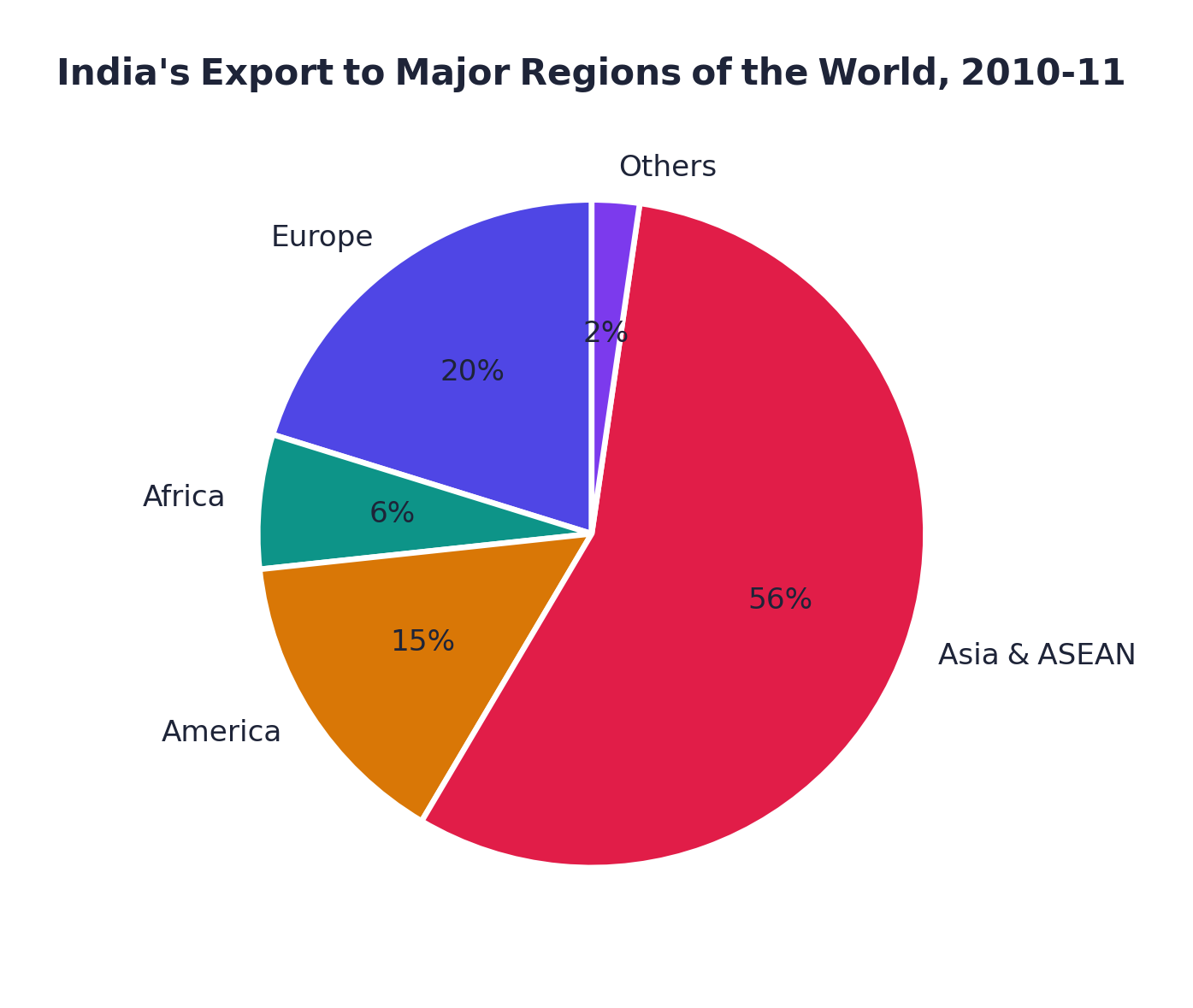
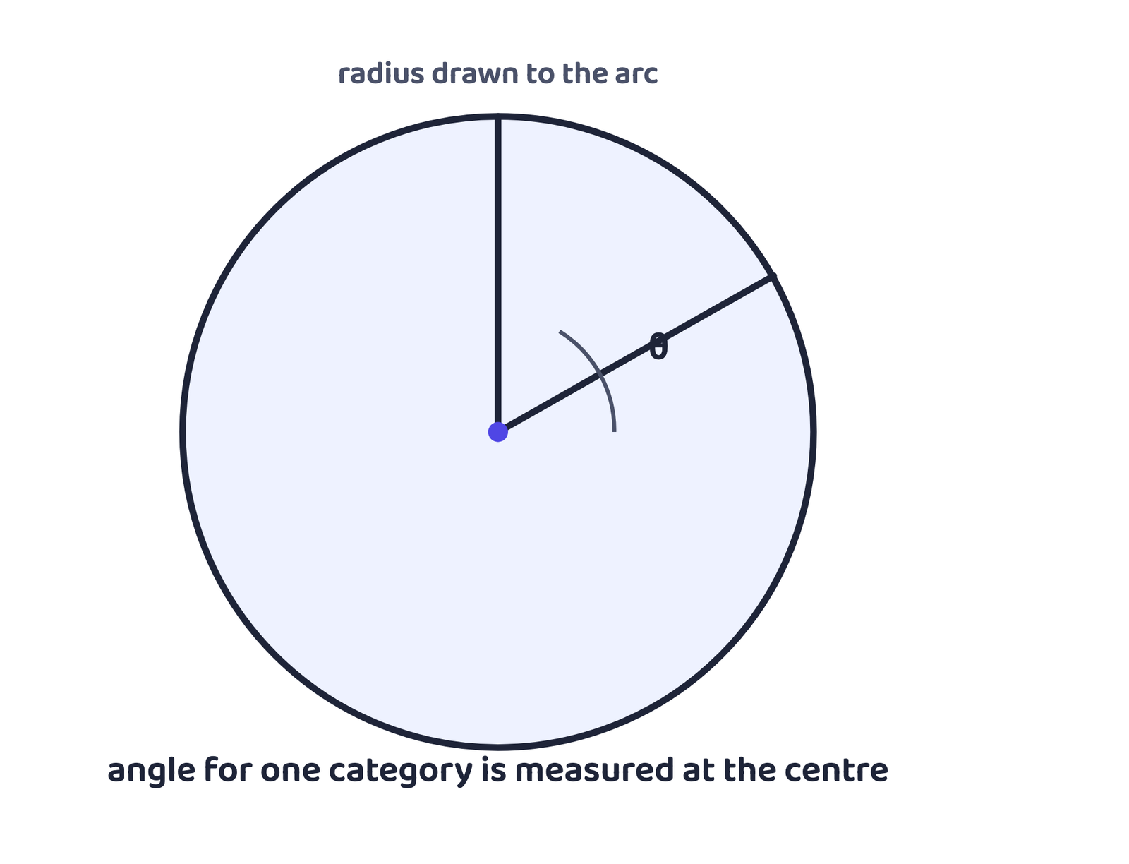
A pie diagram (also called a Divided Circle Diagram) represents the total value of a given attribute as a circle, divided into sectors whose angles are proportional to the sub-sets of the data.
6.1 Calculating the angle
India’s exports to major world regions, 2010-11 (% of Indian exports):
| Region | % | Calculation | Angle |
|---|---|---|---|
| Europe | 20.2 | 20.2 × 3.6 | 73° |
| Africa | 6.5 | 6.5 × 3.6 | 23° |
| America | 14.8 | 14.8 × 3.6 | 53° |
| Asia & ASEAN | 56.2 | 56.2 × 3.6 | 203° |
| Others | 2.3 | 2.3 × 3.6 | 8° |
| Total | 100 | 360° |
Source: Economic Survey, 2011-12
6.2 Construction and precautions
✓ Do this
- Choose a circle radius that is neither too big to fit the space nor too small to read
- Plot the smallest angle first, then move up
✗ Never do this
- Start with the biggest angle first, small errors accumulate and the smallest angle becomes hard to plot accurately
7 Flow Chart / Flow Map
A flow chart (or flow map) is a combination of a graph and a map, drawn using lines of proportional width to show the flow of people or commodities between places of origin and destination. It is also called a Dynamic Map.
A transport map showing the number of passengers or vehicles moving on different routes is the standard example. Government transport agencies use flow maps to show the density of traffic on different routes.
7.1 What a flow map needs
What it can represent
The number and frequency of vehicles by direction of movement, OR the number of passengers / quantity of goods transported.
What it needs
A route map with connecting stations; flow data with origin and destination; a scale to fix the width of each line.
Example 3.8 uses the number of trains running on 16 railway routes around Delhi (from 6 trains on the smallest route to 50 on the busiest). Example 3.9 draws a water-flow map of the Ganga basin, using a scale of 1 cm width = 50,000 cusecs.
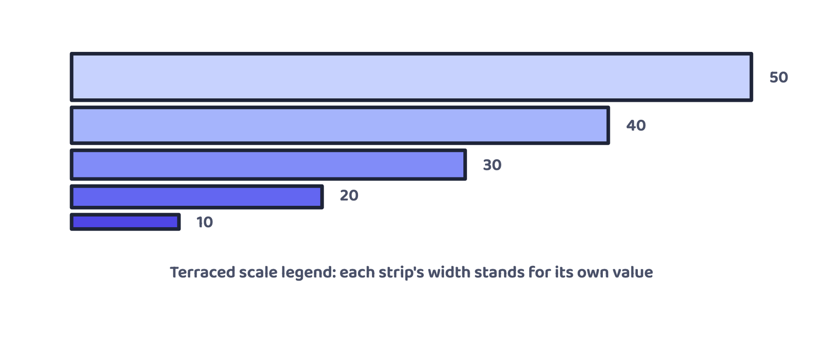
Construction, step by step: take a route map showing the connecting stations → choose a scale for the line thickness (in Example 3.8, 1 cm = 50 trains, so the busiest route gets a 10 mm strip and the smallest a 1.2 mm strip) → draw each route’s strip at its calculated thickness → add a terraced (stepped) scale as the legend, with distinct symbols marking the stations.
“Dynamic Map” in an MCQ always means flow map: it is the only NCERT map named for showing movement rather than a fixed distribution.
8 Thematic Maps
Graphs and diagrams are good at comparing internal variation, but they cannot show a regional perspective, where something happens on the ground. That is what a map does. Maps drawn to show the regional distribution of a theme are called thematic maps (also known as distribution maps).
8.1 Requirements and rules for thematic maps
What it needs
State/district-level data on the chosen theme; an outline map with administrative boundaries; a physical map of the region (e.g. a physiographic map for population distribution, or a relief and drainage map for a transport map).
What the final map must show
Name of the area, title of the subject matter, source of the data and the year, a key to symbols/colours/shades, and the scale, plus a suitable method for the theme.
Quantitative (statistical) maps
- Show measurable variation in the data
- Example: rainfall bands: >200 cm, 100-200 cm, 50-100 cm, <50 cm
Non-quantitative (qualitative) maps
- Show non-measurable characteristics only
- Example: a map that simply marks “high rainfall” vs “low rainfall” areas
Because of time, the chapter limits itself to three quantitative map types, each is its own section below: dot maps, choropleth maps and isopleth maps.
8.2 Dot map
A dot map shows the distribution of a phenomenon (population, cattle, crop type) by marking dots of the same size, each dot standing for a fixed value, on the map’s administrative units.
What it needs
An administrative map with state/district/block boundaries; statistical data per unit (e.g. total population); a scale fixing the value of one dot; a physiographic/relief map of the region.
Precautions
Boundary lines must not be very thick or bold; every dot must be exactly the same size.
To represent India’s population (2001) with each dot worth 1,00,000 people, the number of dots for a state is found by dividing its population by 1,00,000, rounding up when the fraction exceeds 0.5.
Given
Maharashtra’s population (2001) = 9,67,52,247; one dot = 1,00,000 people
Find
Number of dots for Maharashtra
9,67,52,247 ÷ 1,00,000 = 967.52 → rounded up to 968 dots (the fraction, 0.52, is more than 0.5)
A few states from the same table, for practice: Jammu & Kashmir 1,00,69,917 → 100 dots · Punjab 2,42,89,296 → 243 dots · Uttar Pradesh 16,60,52,859 → 1,660 dots · Bihar 8,28,78,796 → 829 dots · Kerala 3,18,38,619 → 318 dots · Tamil Nadu 6,21,10,839 → 621 dots.
8.3 Choropleth map
A choropleth map shows a data characteristic tied to administrative units, such as density of population, literacy rate or sex ratio, using graded shades or colours, one shade per category.
Literacy rate in India, 2001: lowest is Bihar (47.0%), highest is Kerala (90.9%, taken as 91.0 for the range).
Range = 91.0 − 47.0 = 44.0 → Interval = 44.0 ÷ 5 = 8.8, rounded to 9.0
| Literacy rate range | Category | States (examples from the data) |
|---|---|---|
| 47 – 56 | Very low | Bihar, Jharkhand, Arunachal Pradesh, Jammu & Kashmir |
| 56 – 65 | Low | Uttar Pradesh, Rajasthan, Andhra Pradesh, Meghalaya, Odisha, Assam, Madhya Pradesh, Chhattisgarh |
| 65 – 74 | Medium | Nagaland, Karnataka, Haryana, West Bengal, Sikkim, Gujarat, Punjab, Manipur, Uttarakhand, Tripura, Tamil Nadu |
| 74 – 83 | High | Himachal Pradesh, Maharashtra, Delhi, Goa |
| 83 – 92 | Very high | Mizoram, Kerala |
8.4 Isopleth map
An isopleth is an imaginary line joining places of equal value, drawn on the basis of natural (not administrative) boundaries, used where data has spatial continuity, like temperature, pressure or rainfall. The word comes from iso (equal) + pleth (lines). A map made of such lines is an isopleth map.
| Isopleth | Shows equal… |
|---|---|
| Isotherm | Temperature |
| Isobar | Pressure |
| Isohyet | Rainfall |
| Isoneph | Cloudiness |
| Isohel | Sunshine |
| Contour | Height (elevation) |
| Isobath | Depth |
| Isohaline | Salinity |
What it needs
A base map with point locations; data for a defined time period; drawing instruments, especially a French Curve.
Rules to follow
Choose an equal interval: 5, 10 or 20 is ideal; write the isopleth’s value along the line or by breaking the line; isopleths of equal value never cross each other.
8.5 Interpolation
Interpolation is the method of inserting an intermediate value between two known, observed values at two locations, for example finding where a 30 °C isotherm falls between a station reading 28 °C and another reading 33 °C. Drawing isopleths that join places of equal value is itself an act of interpolation.
Given
Two stations read 28 °C and 33 °C; distance between them on the map = 1 cm (10 mm); the isotherm wanted is 30 °C
Find
Where the 30 °C isotherm should be drawn
Difference between the two readings = 33 − 28 = 5. The value 30 is 2 points above 28 and 3 points below 33.
So the 30 °C isotherm is plotted 4 mm from the 28 °C station (or, the same line, 6 mm from the 33 °C station).
- Can I name the three golden rules for any diagram or map, and the three parts of “design”?
- Can I tell a multiple bar diagram apart from a compound bar diagram, in one line?
- Can I calculate the angle for a pie-diagram sector from a percentage?
- Can I state why the biggest pie-diagram angle should never be plotted first?
- Can I name all eight isopleths and what each one shows?
- Can I work out the exact position of an isopleth using the interpolation formula?
- Every diagram or map needs the right method, the right scale, and Title + Legend + Direction in its design
- Diagrams are one-, two- or three-dimensional depending on how many dimensions carry the value
- Line graph = time series as points joined by a line; polygraph = several such lines together
- Bar diagrams: simple (one variable), multiple (variables side by side), compound (variables inside one bar)
- Pie diagram angle = (value ÷ total) × 360°, or percentage × 3.6, always plot the smallest angle first
- Flow map = graph + map, using proportional line width; also called a Dynamic Map
- Thematic maps give the regional picture that graphs cannot; this chapter covers dot, choropleth and isopleth maps
- Choropleth interval = Range ÷ 5, grouped into 5 categories from very low to very high
- Isopleth = a line of equal value on natural boundaries; interpolation locates it exactly between two readings
- 1 markWhich one of the following maps shows the population distribution?
(a) Choropleth map(b) Isopleth map(c) Dot map(d) Square root map - 1 markWhich one of the following is best suited to represent the decadal growth of population?
(a) Line graph(b) Bar diagram(c) Circle diagram(d) Flow diagram - 1 markA polygraph is constructed to represent:
(a) Only one variable(b) Two variables only(c) More than two variables(d) None of the above - 1 markWhich one of the following maps is known as the “Dynamic Map”?
(a) Dot map(b) Choropleth map(c) Isopleth map(d) Flow map - 1 markThe angle for a pie-diagram sector is calculated by multiplying the percentage share by:
(a) 3.6(b) 6.3(c) 36(d) 360 - 1 markIn a choropleth map, the class interval is found by dividing the Range by:
(a) 3(b) 4(c) 5(d) 10 - 1 markAn isopleth joining places of equal temperature is called:
(a) Isobar(b) Isotherm(c) Isohyet(d) Isohel - 1 markIn a compound bar diagram, the different variables are shown as:
(a) Separate bars placed side by side(b) Segments within a single bar(c) Dots of different sizes(d) Sectors of a circle - 1 markWhile plotting a pie diagram, the angles should be measured starting with:
(a) The largest angle first(b) The smallest angle first(c) Any order, it does not matter(d) Alphabetical order of the categories - 1 markA drawing instrument especially useful for drawing isopleths is the:
(a) Set square(b) French Curve(c) Protractor(d) Divider
Reason (R): NCERT’s method groups choropleth data into exactly five categories: very low, low, medium, high and very high.
Reason (R): Starting with the biggest angle causes small errors to accumulate, making the smallest angle difficult to plot accurately.
Reason (R): A flow map is drawn using lines of proportional width to show the movement of people or goods.
Reason (R): Isopleths are imaginary lines that join places of equal value, based on data recorded at known points.
- 2 marksWhat is a thematic map?
- 2 marksWhat do you understand by “representation of data”?
- 2 marksDifferentiate between a multiple bar diagram and a compound bar diagram.
- 2 marksWhat are the requirements to construct a dot map?
- 2 marksWhat is an isopleth map? How is interpolation carried out?
- 3 marksDescribe and illustrate the important steps to be followed in preparing a choropleth map.
- 3 marksDiscuss the important steps to represent data with the help of a pie diagram.
- 2 marksName the three golden rules that must be followed while drawing any diagram or map.
- 2 marksWhat are the three components of the “design” of a map, and why is each one needed?
- 2 marksWhy can a graph or diagram not give a regional perspective, while a thematic map can?
- 5 marksExplain, with the construction steps, how a line graph is drawn. Why must the scale on the Y-axis show negative values if the data contains any?
- 5 marksDescribe the method of constructing a flow map. What two types of data can a flow map represent?
- 5 marksWhat is a choropleth map? Explain, with a worked example, how the class interval and the five categories are determined.
- 5 marksDefine isopleth. Name any six isopleths with what each one represents, and state the rules to be followed while drawing them.
- 4 marksDistinguish between a quantitative (statistical) map and a non-quantitative (qualitative) map, with one example of each.
- 4 marksIndia’s land use, in percentage of total area. Net Sown Area: 42 (1950-51), 46 (1998-2001); Forest: 14, 22; Not available for cultivation: 17, 14; Fallow land: 10, 8; Pasture and tree crops: 9, 5; Culturable waste land: 8, 5.
Calculate the pie-diagram angle for each category for 1998-2001, and state which diagram is most suitable for this data and why. - 4 marksA state has a population of 5,42,00,000. Using a scale of 1 dot = 2,00,000 people, calculate the number of dots needed to represent it on a dot map.
- 4 marksTwo weather stations 2 cm apart on a map record temperatures of 24°C and 32°C. Using the interpolation formula, find the exact position (in cm from the 24°C station) of the 28°C isotherm.
- 3 marksA data set’s highest value is 96 and its lowest value is 16. Calculate the Range and the choropleth class interval, and list the five category boundaries.
- 3 marksRice area (in % of total) across six states: West Bengal 12.3, Uttar Pradesh 13.2, Andhra Pradesh 9.1, Punjab 5.9, Tamil Nadu 4.8, Bihar 8.3. Which diagram would best show this for immediate comparison across states, a simple bar diagram or a pie diagram? Justify your choice in one line.